Sunday, 19 February 2012

Chosen 'Empire- inspired' Magazine Layout

Inspired by the known film magazine 'EMPIRE' I have collated many common codes, conventions and features which all contribute to a successful reproduction of a magazine interview.

Certain features have been directly recreated in my own style such as the layout/title and image placement to an interview with Daniel Radcliffe seen earlier in an older post. These conventions appealed to me and were successful in attracting a reader's eye and attention but also for creating an exciting, artistic and creative tone and design to the article.

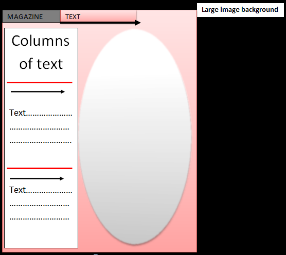
Below, is a draft sketch of the chosen layout decided for my Director interview, then followed by an A4 one page spread of my entire film teaser poster for 'TWISTED.' 

I am very happy with this final layout choice as I believe it incorporates each common convention sophisticatedly without simply reproducing an 'Empire' article but purposefully taking inspiration and combining it with my own artistic intention to create the above.

I have carefully considered the following:
  • size/font/facing/angles of text
  • placement of text
  • image placement
  • layout of text (in vertical columns)
  • colours (dark red/white/black)
  • common codes i.e. photo captions/introductory information/photography references
in an attempt to draw similarities with the work of 'Empire' magazine but also to display my individual style and creativity.

Chosen Film Title and Style

I have now reached the stage in this ongoing process where I have chosen the font and style of writing I believe suits, matches and overall enhances the theme of the film genre I am presenting.

Below is the chosen title and style:

As I stated in an older post, this font is very much similar to typography used in the young new wave of urban films we see nowadays
  • The bold black effect is very strong and effective.
  • The jagged, disjointed effect on the lettering could be connotations to anger, corrupton, breaking points and violence which are vital aspects to these new genre of film.

Initially I was more inclined to choose another font (see right) which alternated the facings of letters. This also included detailed imagery of barbed wire intertwining with the letters, however after detailed analysis of typography used in previous urban films I noticed how more emphasis and focus was set upon the image of characters and location rather than the title itself.


I am very content with my final decision as I believe it is the most successful typography to utilise in order to replicate and closely recreate a new urban film similar to previous releases but also suits very much the ideas and potential storyline behind the film 'TWISTED.'

Monday, 6 February 2012

Interview Style Model

I will now choose a suitable and relevant interview style model whereby I will replicate the common codes + conventions including the use and placement of images, text, font, sizes, text boxes, and certain magazine conventions.

Below is a TotalFilm Interview which I would like to analyse and recreate:

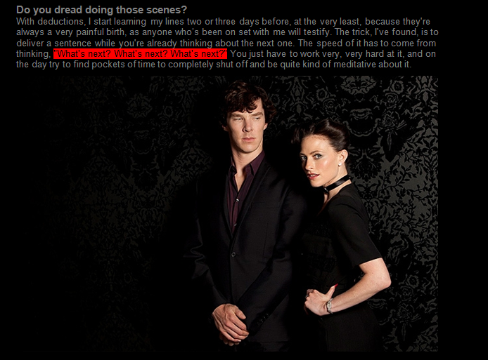
I have annotated this style model above deconstucting the many common codes used to create an engaging, eye-catching yet informative and suitable to the magazine its representing. In this case , it would be 'TOTAL FILM.'

  • Most of all, I really like the format of this article with the divide between text and imagery
  • It is clear, simple yet very effective
  • equal importance and significance
I have chosen to reproduce this format for my final interview piece, where I shall place text (Director's interview) on the left and the film teaser poster on the right.

Below is a second TotalFilm Interview which I would like to recreate when  exploring the Director's interview:
I was attracted to layout of this article with the effect of the text being written almost on the background image. I wish to replicate this for the third page of my production piece when interviewing the director of the film.

Taking these two main ideas and interview deconstructions into account, I am able to design and create a similar yet new layout for my production piece.

These two sketches provide an outline of my final interview layouts and formats including the essential, common codes of: COLOUR, TEXT, IMAGES, FONT,SIZES,CAPTIONS

Sunday, 5 February 2012

Appearances/Outfits of models

I have reached the point where I have chosen my male and female models for my linked production piece, therefore the next stage is to start constructing the piece.

One important factor of my production piece is the chosen, replicated outfits and overall appearances of my characters. This is key in order to:
  • clearly reproduce a similar style of film poster to my style models (i.e. Kidulthood/4.3.2.1)
  • translate the youth of today, for example the ages of the models (15-17)
However, I have decided to integrate two different styles which both simultaneously represent the young people of today:
  • one being the 'Skins' style, growing 'indie' fashion


  • secondly, the expected wear of 'hoodies' and youngsters involved in gangs needs to be shown highlighting my close identification of the outfits used in my style models
  • the 'Chav' image is important to bring into my characters appearance

Wednesday, 1 February 2012

Sample Models

GIRLS


BOYS


Film Poster Locations

I have chosen Deptford, Creekside as my main location for shooting as it is accessible, available and also fits the style models such as 'Kidulthood'
  • the 2 headshots will be close up shots of the faces from a side angle, I am planning to crop background out and place the images upon the brick wall background

  • a possible background- grey concrete brick wall
  • (either take a simple middle level camera shot and expand it or find a sutiable backdrop)


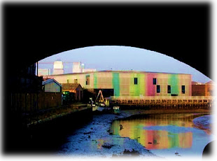
This image is taken around the back roads of Deptford, Creekside (near to the LABAN centre) and immediatly I can visualise the brick wall/archways as possible locations.


  • background for gang image- natural surrounding of the LABAN centre, Deptford
  • theres a brick wall which allows characters to sit or stand in the gang image, railings emphasising working class, council estate signs, backdrop of washed up River Thames


Sample Poster Layout

For my final film poster, I have drawn ideas from the many I have analysed including key elements in terms of location, background, text, fonts size, images, colour and common codes + conventions.

Below, is a first draft/sketch of my film poster idea

Ideas behind the poster

The film idea: 1 boy,1 girl meet by chance and develop strong feelings for each other however due to the boy's involvement in gang culture stops their relationship.
The girl is from a middle class background, and the boy is typically working class and is deputy leader of a well known gang.

The layout of the poster reflects this plot clearly and also combines the style of grime/urban and more recent "skins" effect.
  • the two side-on facial headshots will be 2 models, 1 boy, 1 girl staring at each other representing their growing romantic relationship
  • I decided to have a simple background with alot of detail within the layout of the poster, so I will shoot a brick wall (grey) as the backdrop to images
  • use of brick wall is ideal- as it relates and is quite stereotypical with reference to previous film posters (Kidulthood - gang sitting on brick wall)
  • from analysing a number of UK gang orientated film posters, I found a common code is at least 1 image of a gang is essential
  • CENTRAL IMAGE- therefore, a 3D style image of the gang will be placed in the middle of the poster giving the characters instant importance and central to the storyline
  • TITLE PICTURE- symbolic image diagonally slanted on the end of 'TWISTED' of a red rose intertwined with barbed wire (only colour in the poster/inspiraion of film title)
  • TEXT - film title is 'TWSTED' and will be stated centrally at the top, bold, large letters and the creative font will be chosen from selection below in older post
  • CAPTION "2 LIVES.1 LOVE." - stated in much smaller text in the centre across the page

Wednesday, 25 January 2012

Typography

Now, I want to explore typography as a separate issue.

I have explored the use of typography, and how and what image it can create; for example it is used to produce:
  • three dimensional images
  • illusions
  • simple statements
  • displaying ideas/concepts of gang culture
As 'TWISTED' is a possible film title for my linked production piece I have used this word and added differently styled and manufactured fonts keeping mind the suitability, relevance and overall presentation of the poster.
I have completed this by using http://www.dafont.com/

Here are a chosen number of fonts which are relevant and suitable to the style I am aiming to achieve but at this point in the process these are still ideas.

This is an example of a more conservative approach, but what is successful is the gothic, contemporary edges of each letter. The slight italic styling also adds to the modern, young image I will be proposing.  (Similar to 'Kidulthood' and 'Adulthood' as capital letters with small variation horizontally reads and simply states the film title + allows the image to dominate and tell the story.)


Above, is a more youthful angle on the styling of the title. The white outlining around the capital letters and the faded colour effect gives the text an urban feel, however does draw similarities to text used in American Universities


This font is very much similar to typography used in the young new wave of urban films we see nowadays. The bold black effect is very strong and effective. The jagged, disjointed effect on the lettering could be connotations to anger, corrupton, breaking points and violence which are vital aspects to these new genre of film.

Above, the font is again diverse to other styles and creates more of an illusion and hard-to-stare-at vision.

This font has a strong concept which relates brilliantly to a idea I have had regarding my linked production piece. I will later post my first sketch/idea of a film teaser poster including
  • 2 faces (1 man, 1 woman) in the forefront staring at each other
  • with a grey concrete brick wall as the background
  • central to the image is the man's friends/gang he is a part of creating a similar stance to characters in 'Kidulthood'
  • an idea occurred of the intertwined/twisted relationship of barbed wire and roses which symblises the storyline of the torted and painful love and relationship between this man and woman from very different lives with complicaions of his gang
  • TITLE 'TWISTED'
  • CAPTION '2 LIVES. 1 LOVE'
Returning back to the chosen font, the lower case lettering is dissimilar to large capitals typically used, however the twisting of the letters and the jagged,broken up line running through the title relates so well to my current idea of barbed wire.

Typography - analysis

Studying a variety of Film Teaser posters, I have noticed the presentation of text and how significant where it is, what it appears like, the message it sends across and its relevance/suitability to the theme of the whole poster..........

Firstly, I will analyse past film posters I have displayed in older posts focusing wholly
  • on the text used 
  • appearance (colours, editing style)
  • size
KIDULTHOOD

4.3.2.1

Tuesday, 24 January 2012

Text/Language/Formality of 'Total Film' Magazine

Now, I will study the use of
  • text
  • language
  • punctuation
  • structure
in terms of the
  • overall formality
  •  attitude of the magazine
  • voice of the writer

I have drawn information both from print issues of 'Empire' and also the text interviews available to view online at http://www.totalfilm.com/
I will deconstruct and break down the text, language, punctuation and structure of a written based interview understanding the questions asked, the manner in whcih they are asked and whether humour is favoured over formality,or even used at all.

Also, notice the common codes + conventions used to identify the article with 'Total Film.'


Common Codes + Conventions

I have analysed the text, punctuation, structure and mise en scene of an 'Total Film' text interview and have concluded that this extract from 'Total Film' is similar to 'Empire' in the sense that much technical language is used in questions and the response; however there is some informality evident in terms of certain words and humour. Also, from this article I have understood that 'Total Film' is much more descriptive in terms of where the interview takes place and the appearance of the interviewee.

Below, are a list of common conventions which are evident mostly in all 'Total Film' articles but in all magazine articles or features:

  • Heading + sub heading (introductory line)
  • V.COMMON- states 'by 'TotalFilm' and the date issued '18th Jan 2012'
  • Questions are more simlar to general statements
  •  Statements are in bold and to an extent in a larger size and font
  • Questions are unbold to differentiate the questions to the interviewee's answers
  • Large images - coloured, stylish photos which break up the text-relevant to the subject matter

Text/Language/Formality of 'Empire' Magazine

Now, I will study the use of
  • text
  • language
  • punctuation
  • structure
in terms of the
  • overall formality
  •  attitude of the magazine
  • voice of the writer


I have drawn information both from print issues of 'Empire' and also the text interviews available to view online at http://www.empireonline.com/

I will deconstruct and break down the text, language, punctuation and structure of a written based interview understanding the questions asked, the manner in whcih they are asked and whether humour is favoured over formality,or even used at all.

Also, notice the common codes + conventions used to identify the article with 'Empire.'

Common Codes + Conventions

I have analysed the text, punctuation, structure and mise en scene of an 'Empire' text interview and have concluded although very formal and technical language is used both in the answers and questions, there is additonally a very informal attitude towards the questions and voice of the writer.

This includes the slight use of humour, allowance of swearing (inappropriate language) and the use of words such as 'Yeah' rather than 'Yes.'

Below, are a list of common conventions which are evident mostly in all 'Empire' articles but in all magazine articles or features:

  • Heading + sub heading (introductory line)
  • Dividing line which separates title from the main body of the text
  • Questions are in bold and to an extent in a larger size and font
  • Questions are unbold to differentiate the questions to the interviewee's answers
  • Large images - sophisticated, classic photos which break up the text-relevant to the subject matter
  • V. COMMON- at the end of the inteview, a line of text relating to another article which may be of interest to the reader, in this case 'Martin Freeman talks Sherlock' (fellow actor)
  • A 2nd line of text - gives vital information on the basis of the interview (Sherlock Holmes, BBC, and also where to grab an 'Empire' issue)
  • Thirdly, it states 'Interview by Nick de Semlyen' - which identifies the reader with who is responsible for the interview and also the strong, critical or humorous voice of the article